Why Responsive Table?
Responsive web design (RWD) is the term, mostly used now a days, when we talk about the Web/UI development. Today, RWD has got a greate importance. Most of the websites are viewed on mobile or other devices by most of the users. In this scenario, it is good to have a good knowledge about the Responsive Web Design. Once we get the knowledge of what is responsive design, it is good to know how to make a responsive table.
When we develop web applications which has got data tables, to make responsive table is a headache for the developers. Normal tables will not be fully visible on devices like smartphones.
Tables can’t always adjust to the available space on the screen automatically. The reason is that their content usually requires a certain minimum space. So, this will lead to ugly behavior on small screens, like those of phones and tablets. The full content of the table is not visible on devices.
It is easy to create responsive table with bootstrap or other frame works. But how to create responsive table without using any plugin or frameworks? Only with CSS, responsive table is possible?. The Responsive Table idea gives a solution for this. On devices, responsive table will simply change the layout of the table. Thus the table is tilted to the side and the contents are scrollable. The layout of the table is completely changed.
Here, we’ll see how to make a responsive table, by the way of changing the layout with CSS3 media queries.

HTML For Responsive Table
<table>
    <thead>
        <tr>
            <th>First Name</th>
            <th>Last Name</th>
            <th>Job Title</th>
            <th>Joining Date</th>
            <th>Total Experience</th>
            <th>Relevant Experience</th>
            <th>Date of Birth</th>
            <th>Current City</th>
            <th>Prefered City</th>
            <th>Nationality</th>
       </tr>
   </thead>
   <tbody>
       <tr>
            <td>John</td>
            <td>Marks</td>
            <td>Developer</td>
            <td>January 01, 2013</td>
            <td>5</td>
            <td>4</td>
            <td>June 30, 1985</td>
            <td>Bangalore</td>
            <td>Bangalore</td>
            <td>Indian</td>
       </tr>
       <tr>
            <td>Tom</td>
            <td>Moody</td>
            <td>Developer</td>
            <td>December 15, 2012</td>
            <td>6</td>
            <td>6</td>
            <td>May 24, 1980</td>
            <td>Delhi</td>
            <td>Delhi</td>
            <td>Indian</td>
      </tr>
   </tbody>
</table>
CSS for Responsive Table
/* Section One*/

th { background: #c5c5c5;}
table {
	border-collapse: collapse;
	border: 1px solid #cdcdcd;
	font: normal 12px arial;
	width: 100%;
}
td, th { border: 1px solid #cdcdcd; padding: 2px;}

/* Section two*/

@media only screen and (max-width: 760px),
(min-device-width: 768px) and (max-device-width: 1024px)  {
	/* Section three*/
		table, thead, tbody, th, td, tr {
			display: block;
		}
		/* Section four*/
		thead tr {
			position: absolute;
			top: -9999px;
			left: -9999px;
		}

		tr { border-bottom: 1px solid #ccc; }
/* Section five*/
		td {
		     border: none;
		     border-bottom: 1px solid #eee;
		     position: relative;
		     padding-left: 50%;
		}
		td:before {
			position: absolute;
			top: 3px;
			left: 6px;
			width: 45%;
			padding-right: 10px;
			white-space: nowrap;
                        font-weight: bold;
		}
		/* Section six*/

		td:nth-of-type(1):before { content: "First Name"; }
		td:nth-of-type(2):before { content: "Last Name"; }
		td:nth-of-type(3):before { content: "Job Title"; }
		td:nth-of-type(4):before { content: "Joining Date"; }
		td:nth-of-type(5):before { content: "Total Experience"; }
		td:nth-of-type(6):before { content: "Relevant Experience"; }
		td:nth-of-type(7):before { content: "Date of Birth"; }
		td:nth-of-type(8):before { content: "Current City"; }
		td:nth-of-type(9):before { content: "Prefered City"; }
		td:nth-of-type(10):before { content: "Nationality"; }
}

/* Section seven*/
	@media only screen
	and (min-device-width : 320px)
	and (max-device-width : 480px) {
		body {
			padding: 0;
			margin: 0;
			width: 320px; }
		}
/* Section eight*/
	@media only screen and (min-device-width: 768px) and (max-device-width: 1024px) {
		body {
			width: 495px;
		}
	}

CSS for Responsive Table explained
‘Section one’ is the main style for the table. In ‘Section Two’, we are adding styles for making responsive table, on device resolution 760px. CSS3 media query is used to achieve the responsiveness for the table. When we come to ‘Section Three’, we are forcing the table to display as a block, and not to display as a table.
‘Section Four’ of the CSS for Responsive Table is for hiding the table header. But here actually we are not hiding the table header using display:none, instead positioning it absolutely and adding ‘-‘value for left and top position.
In ‘Section five’, we are making the td to behave like a row and making the table header. And in ‘Section Six’, we are adding content/header text for the tranformed table. Index wise, we are adding the text for headers of the responsive table.
‘Section Seven’ is for making the table compatible on smartphones on both landscape and portrait modes. The next section shows, css for iPads on both modes.
So, this way, we can make a responsive table and make it work well on different resolution smartphone and iPads.
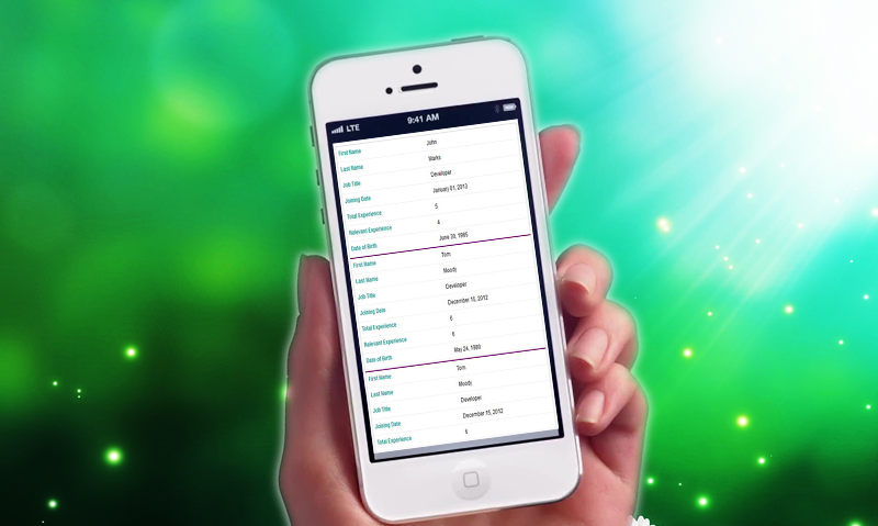
Responsive Table display on small resolution
This is the way , responsive table will display on small resolution.

Demo for Responsive Table
Please click Responsive Table to see the demo.
Try creating a Responsive Table with the given CSS and HTML. If able to make this work or if any issue for making it work, feel free to contact or just post a comment.
