In our previous tutorial, we have seen how to create accordion with pure css3. There we have used input radio and the :checked pseudo-class and using hidden inputs and labels. If we remember the way how we created the accordion with css3, it will be easy to for us to create tabs with css3.
Tabs with CSS3
We are very familiar with content tabs and we know that they are very commonly used component in web design, and often their turn out to be pretty useful. Jquery UI was used for creating Tabs in our web pages. The potentiality of CSS3 gives a simple way to create Tabs without using jquery plugins. So, in this tutorial we are going to implement some simple CSS3 content tabs using radio buttons together with the :checked pseudo-class and sibling combinators.
HTML for the Tabs with css3
Following is the HTML for the tabs with css.
<section class="tabs">
    <input id="tab-1" type="radio" name="radio-set" class="tab-selector-1" checked="checked" />
	<label for="tab-1" class="tab-label-1">Tab One</label>

	<input id="tab-2" type="radio" name="radio-set" class="tab-selector-2" />
	<label for="tab-2" class="tab-label-2">Tab Two</label>

	<input id="tab-3" type="radio" name="radio-set" class="tab-selector-3" />
	<label for="tab-3" class="tab-label-3">Tab Three</label>

	<input id="tab-4" type="radio" name="radio-set" class="tab-selector-4" />
	<label for="tab-4" class="tab-label-4">Tab Four</label>

	<div class="clear-shadow"></div>

	<div class="content">
		<div class="content-1">
            <p>Some content</p>
		</div>
		<div class="content-2">
            <p>Some content</p>
		</div>
		<div class="content-3">
            <p>Some content</p>
		</div>
		<div class="content-4">
            <p>Some content</p>
		</div>
	</div>
</section>
We are using input elements to connect to the division with the class content. The content division includes all the tab pages. For each input element we’ll have a label element. We need to style all the labels to look like tabs.
CSS3 for Tabs with CSS3
Here we start styling the tabs and content area.
.tabs {
            position: relative;
            margin: 40px auto;
            width: 750px;
        }

        .tabs input {
            position: absolute;
            z-index: 1000;
            width: 130px;
            height: 40px;
            left: 0px;
            top: 0px;
            opacity: 0;
            cursor: pointer;
        }
We have styled the section and assigned a fixed width and styled the input and made the opacity to ‘0’ to make it invisible.
With the following css, we will position the input to align with the labels.
.tabs input#tab-2{
    left: 140px;
}
.tabs input#tab-3{
    left: 280px;
}
.tabs input#tab-4{
    left: 420px;
}
We have positioned the input fields. The inputs will be covering the labels. It will seem, as if we click on the label, but actually we are clicking on the input. This is a trick that will also work in mobile browsers (in some mobile browsers, simply clicking the label will not focus the associated input).
Next is styling the labels to look like tabs. Following CSS will do that.
.tabs label {
            background: #AD37A9;
            font: bold 15px/40px Tahoma, Arial;
            position: relative;
            padding: 0 20px;
            float: left;
            width: 100px;
            color: #FFF;
            letter-spacing: 1px;
            text-transform: uppercase;
            text-align: center;
            text-shadow: 1px 3px 1px rgba(123, 119, 119, 0.3);
            border-radius: 3px 3px 0 0;
            box-shadow: 2px 0 2px rgba(0,0,0,0.1), -2px 0 2px rgba(0,0,0,0.1);
        }
The label is ready now. Here we will do some effects like on hover for the label. Also add the z-index for the labels.
.tabs input:hover + label {
            background: #A5109F;
        }

        .tabs label:first-of-type {
            z-index: 4;
            box-shadow: 2px 0 2px rgba(0,0,0,0.1);
        }

        .tab-label-2 {
            z-index: 3;
        }

        .tab-label-3 {
            z-index: 2;
        }

        .tab-label-4 {
            z-index: 1;
        }
Tab is ready now. The next step is to style the label, when clicked or selected.
.tabs input:checked + label {
            background: #fff;
            z-index: 6;
            color: #672055;
        }
A different background color is added for the selected tab or selected label.
Our tab part is ready. Now we have to style the content or the tab page part. We have four tabs to show the tabs with css3.
.content {
            background: #fff;
            position: relative;
            top: 42px;
            width: 100%;
            height: 390px;
            z-index: 5;
            box-shadow: 0 -2px 3px -2px rgba(0,0,0,0.2), 0 2px 2px rgba(0,0,0,0.1);
            border-radius: 0 3px 3px 3px;
            font-family: Cambria, Georgia, serif;
        }

        .content div {
            position: absolute;
            top: 0;
            left: 0;
            padding: 20px;
            z-index: 1;
            opacity: 0;
            transition: all linear 0.1s;
        }

        .content div h2,
        .content div h3{
            color: #398080;
        }
        .content div p {
            font-size: 16px;
            line-height: 22px;
            font-style: italic;
            text-align: left;
            margin: 0;
            color: #777;
            padding-left: 15px;
        }
As mentioned before, the content division will contain all of the tab pages, and we will set its z-index to 5, just to be under the selected label. In this way, the box-shadow of content area will cover all of the other labels.
By default (when their respective label is not selected/clicked) we want them to be hidden. So, we set the opacity to zero and the z-index to 1. We cannot use the display: none property because it’s not supported in transitions.
When we want a content to appear or when the label is clicked, we set the opacity to 1 and raise the z-index because we want this content division to be on top of all the others:
Our content part also ready now. Now we will add some transition for the content part to give a some good feel to the user who uses the tabs with css3.
Transition for the Tabs with CSS3
.tabs input.tab-selector-1:checked ~ .content .content-1,
        .tabs input.tab-selector-2:checked ~ .content .content-2,
        .tabs input.tab-selector-3:checked ~ .content .content-3,
        .tabs input.tab-selector-4:checked ~ .content .content-4 {
            z-index: 100;
            opacity: 1;
            transition: all ease-out 0.2s 0.1s;
        }
A simple transition is added to the content part of the tab section. Just the basic fade in fade out transition is used. We can add different effects with the CSS3 animations.
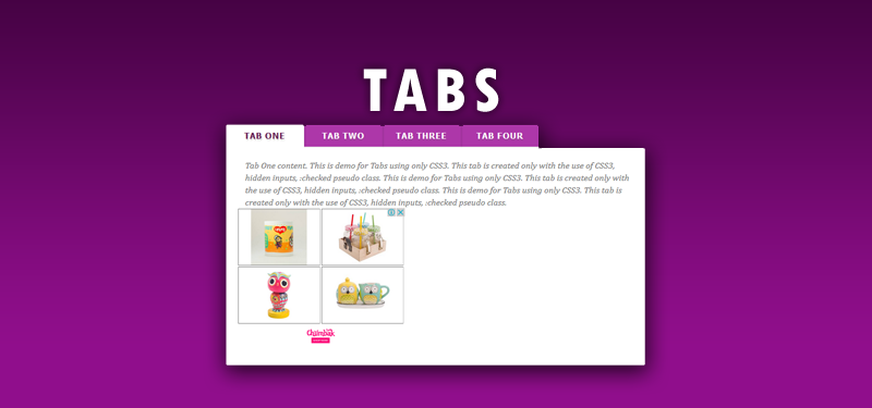
Demo For Tabs with CSS3