Best Practices is something that everyone should follow. All developers, when they want to develop something, they look for some examples, best practices, easiest way to do the work… As web/ui developers, we also look for best practices and best examples or best tips for developing our web pages. So in this tutorial, we will see few things which we should keep in mind as UI developers. I am sure these tips will help you a lot.
What are the best practices for UI developers?
1 Keep things Simple
It is always advisable to keep the things very simple, so that we can avoid unnecessary tensions in the later stage of development. If you find yourself using complicated coding to achieve your design, then you should think again about whether the feature you need is really necessary or if you’re just thinking about your design and not your visitors. Always go for the simplest way of implementing UI. Most of the time designers will give such a complicated design. UI developers have to struggle to implement the layout as per the design, they will do it in such a complicated way and end up in hell.
So, we can say, the complex code is the result of less thinking or codding in a hurry burry. Plan your layout logically and work from the outside in and from the top down where possible. Look at what containers you will need and break jobs down into smaller parcels. First think about the main wrapper, then content inside the wrapper. Make the content inside as separate sections like header, navigation, sub navigation, main content, footer etc…
2. HTML Separate and CSS separate
It is always the best practice to keep your HTML and CSS separately. When you use the external style sheet, it is easy to control your layout, colors, fonts etc.… easily. You might have seen developers using inline styles for saving time. But unfortunately this kind of styling leave you in hell in later stage of development. If there are hundreds of pages, each page, you will have to check for fixing the css.
3 Avoid hacks unless its very necessary
This is an important point as I too often see hacks employed to fix things that aren’t really broken in the first place. Previous days, making web pages compatible for IE was a headache. So we used hacks. But, since many have experienced different kind of issues, they found best way to solve, and they have shared their experience in blogs or forums. Consider google as your best friend and ask the questions you have.
Now, if you want IE specific style sheets, you can use conditional comments and call version specific styles sheets. So when you want to use hacks, think about the best practices
4. Use margins and padding carefully
All browsers apply default padding and margins to most elements and the amount they apply varies quite substantially. Therefore, you need to explicitly control the padding and margins on all the elements you use. So the first step we need to do is to use reset css. Reset all the margins, paddings for all the elements which you are going to use in you web pages. Use ‘*’ to select all the elements.
5. Use of absolute positioning
Mostly the beginners, use the absolute positioning, without understanding it well. This because it is pretty straight-forward and does what it says on the box. However absolute layouts have a number of problems and the biggest problem of all is that absolute elements are removed from the flow.This means that when you absolutely place an element then it has total disregard to whatever else is on your page It will overlap whatever was in that position and will take no notice of other content at all. The result of too much absolute positioning is that you end up having to control everything with absolute positioning and makes for a very rigid and inflexible layout.
In simple words, we can say, use of position absolute will mess up the normal flow of the HTML. Instead of using absolute positioning, you should look into using mostly static positioning, which is the default position, margins and floats to maintain the flow of the layout. If elements flow normally then they have a logical construction and one element follows another without having to position it at all. You can use margins and padding to nudge elements into position or use floats when you want elements aligned horizontally.
6. Validate your code
Another point in best practices is the validation of your code. Use validator tool provided by W3C to validate your web page for HTML and CSS. This will make sure you are using correct HTML and css. Do this check at certain intervals of your development, inorder to avoid double work at the end.
7. Avoid unnecessary codes
At every stage during development ask yourself whether you need that extra div, span, li or not. Can I use pseudo elements instead of adding one more element? Thinking ahead and planning your layout beforehand will often lead to more concise code and an easier-to-manage layout.
8. Flexibility
Remember that a web page isn’t the same as a printed page and that ultimately the user has more control over how your page will appear than you do
With this in mind try to allow for some flexibility in your design so that things like text resizing issues don’t break your layout. Don’t make everything a fixed height/width or at least use ems to allow the layout to expand when text is re-sized. Read more about EM and REM in my previous article. With a little thought and patience you can still make your page look good and satisfy accessibility requirements.
9. Responsive Web Design (RWD)
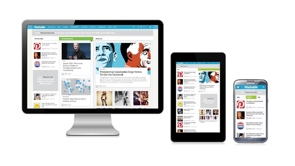
As everybody knows, mostly the websites are accessed on devices. So it is important to consider mobile compatibility when you develop your pages. There are thousands of devices with different resolutions, available in the market and used by people. So, while we develop, consider mobile first and do progressive enhancement. Use media queries for targeting different resolutions. Use Chrome or Firefox’s emulator option to check the responsiveness of your pages.
10. Browser support

There is always complaints from designer’s or QA is that the page is not displaying as per the design on this browser. So, to avoid these kind of complaints to an extend, plan properly before the development starts. Confirm which are the browsers or devices we need to support. This will of course be based on many factors like the users, purpose of the application etc… Once you have decided what browsers to support then make sure that you have access to these browser and test the page frequently.
11. Use more semantic HTML
It is important to use more semantic HTML. Semantic means more meaningful HTML tags. Other than using ‘div’s for displaying content, use header elements like h1, h2, h3. Use ‘li’ or ‘ol’ for list items. ‘p’ tag for paragraphs. Use other semantic tags like header, nav, section, footer, block quotes etc accordingly. Use ‘div’s to divide the page into logical sections or when there is no better alternative. If your page is logically divided into sections that use id’s to identify each section then this will allow you to target inner elements in that section without having to over-use classes on each element
Hope now you have a good idea about the best practices for UI development.
