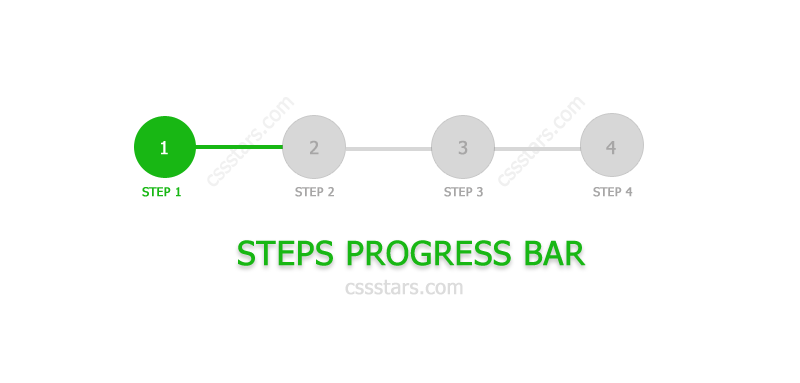
Steps Progress bar : all web developers might have come across such situations where they need to show the step by step progress of some process. Whenever any such requirement comes, we will be searching in google, to find out some plugins which will make our work easy. We keep searching for easy ways.. finally we end up with using some plugins with no flexibility. More over, the plugins may have some complex terms of usage. In this scenario, we will see how to make a simple and easy step progress bar, only with CSS.
HTML For Steps Progress Bar
The following is the html required for creating the steps progress bar.
<div class="progressbar-wrapper">
      <ul class="progressbar">
          <li class="active">Step 1</li>
          <li>Step 2</li>
          <li>Step 3</li>
          <li>Step 4</li>
      </ul>
</div>
First, we will add a wrapper div. Then we will add ul li to show the number of steps. So the html is ready and here comes the main part of the progress bar. Styling or making the look and feel with the help of css.
CSS Code
First part of the css is styling the wrapper and the progress bar ‘li’s. The following css does the work for us.
.progressbar-wrapper {
      background: #fff;
      width: 100%;
      padding-top: 10px;
      padding-bottom: 5px;
}

.progressbar li {
      list-style-type: none;
      width: 20%;
      float: left;
      font-size: 12px;
      position: relative;
      text-align: center;
      text-transform: uppercase;
      color: #7d7d7d;
}
The next step is to add step circles and the connecting lines. We will be using the pseudo elements for achieving this.
.progressbar li:before {
    width: 60px;
    height: 60px;
    content: "";
    line-height: 60px;
    border: 2px solid #7d7d7d;
    display: block;
    text-align: center;
    margin: 0 auto 3px auto;
    border-radius: 50%;
    position: relative;
    z-index: 2;
    background-color: #fff;
}
.progressbar li:after {
     width: 100%;
     height: 2px;
     content: '';
     position: absolute;
     background-color: #7d7d7d;
     top: 30px;
     left: -50%;
     z-index: 0;
}
.progressbar li:first-child:after {
     content: none;
}
We have used the ::before pseudo element for creating the circle. :: after pseudo element is used for adding the connecting lines.
Normal steps are completed here. Now let us see how we can make the completed steps.
.progressbar li.active {
    color: green;
    font-weight: bold;
}
.progressbar li.active:before {
    border-color: #55b776;
    background: green;
 }
.progressbar li.active + li:after {
    background-color: #55b776;
}
For the completed step item, we will add a class ‘active’. The ‘active’ classes properties are background color as green. ::before pseudo element is having property of border-color: green. Yes, now our steps progress bar is ready.
Let us see what we can do to add a background image to the circles.
.progressbar li.active:before {
    background: #55b776  url(user.svg) no-repeat center center;
    background-size: 60%;
}
.progressbar li::before {
    background: #fff url(user.svg) no-repeat center center;
    background-size: 60%;
}
Added image to all the circles and even for the active item. But when item is active, we are adding the background-color: green. Our steps progress bar has become little more stylish now.
If we want to add step numbers, we need to add few more lines of css as follows. The following css will add numbers to the steps depending on the number of list items.
.progressbar {
    counter-reset: step;
}
.progressbar li:before {
    content: counter(step);
    counter-increment: step;
}
Looking very simple? Till now you might have used css progress step bar generators or steps progress bar with some frame works. Now it is very simple and your own code without any library dependencies. Hope it will help developers to reduce their time on steps progress bar development.