CSS3 helps us to add different effects for HTMl elements in our web pages. It helps to add transitions, animations, shadow effects, 3D effects to the HTML elements. Whenever we develop web pages, we use buttons of different sizes, colors. Using css3 we can create a wide variety of buttons which is very stylish. Here we will see css3 3d button, using css3.
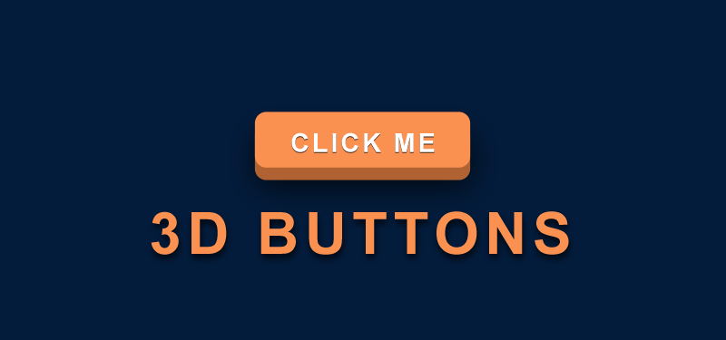
How to create css3 3d button?
How we can use CSS transitions to make it look like a button is 3D when you push it? We can achieve this with the use of an <a> tag and few lines of css.
To create the push effect we are going to use the CSS active selector. On this selector we need to reduce the size of the box-shadow on the button.
HTML for CSS3 3D Button
To create a css3 3D button, we will add ‘a’ tag and add a class ‘myButton’.
<a href="javascript:void(0);" class="myButton" >Push me!</a>
CSS for CSS3 3D Button
.myButton {
	position: relative;
	color: #FFF;
	text-decoration: none;
	background-color: #0599E6;
	font: 700 2.5em arial;
	display: block;
	padding: 4px;
	border-radius: 10px;
	margin: 50px auto;
	width: 200px;
	text-align: center;
	/*Styles for transition*/
	-webkit-transition: all .2s ease;
	-moz-transition: all .2s ease;
	-ms-transition: all .2s ease;
	-o-transition: all .2s ease;
	transition: all .2s ease;
	/*Styles for 3d effect*/
	-moz-box-shadow: 0px 9px 0px #065781, 0px 9px 25px #444545;
	-webkit-box-shadow: 0px 9px 0px #065781, 0px 9px 25px rgba(0,0,0,.7);
	box-shadow: 0px 9px 0px #065781, 0px 9px 25px rgba(0,0,0,.7);
	}

.myButton:active {
		box-shadow: 0px 3px 0px #065781, 0px 3px 6px rgba(0,0,0,.9);
		position: relative;
		top: 6px;
		}
By adding top: 6px, we adding the effect that is is beeing pushed down.
