How to Create a Background Image that Scales with the Browser Window
When you start working with responsive designs, the first thing we consider is that the images can adjust to the screen size as well or background image size. The CSS3 property background-size is used to stretch images to fit in a window, but there is an even better use for this property:
background-size: cover;
The cover keyword tells the browser to scale the image to fit the window. The image is scaled to cover the entire screen, but the original proportions and aspect ratio are kept. The image is placed in the window as large as possible so that the entire window surface is covered.
How to Use background-size: cover; ?
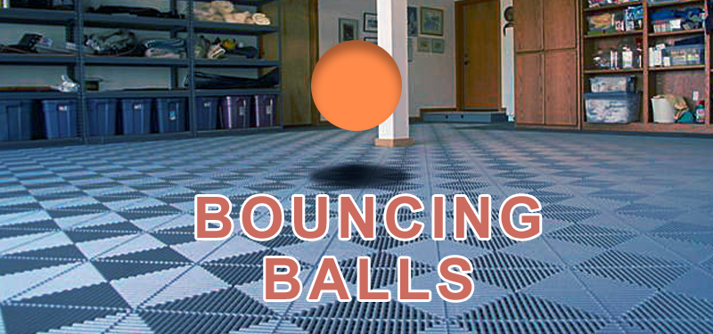
Create a background image. It is better to create an image that is fairly large, as while browsers can make images smaller without a loss in quality, often when they make them larger, the images get fuzzy or blurry. Use the image as background for div with the class ‘wrapper’.
CSS for Background Image Size
.wrapper {
          background-image: url(image.jpg);
          background-repeat: no-repeat;
          background-position: center center;
          background-attachment: fixed;

          -webkit-background-size: cover;
          -moz-background-size: cover;
          -o-background-size: cover;

          background-size: cover;
        }
Add the css in you web page and test this by resizing the browser window or opening the page on different devices with different resolution.
Read more about Scaling background images
