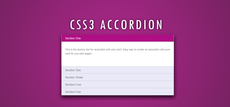
Most of us are aware of jQuery accordion. To create a jQuery accordion, we need to add jQuery and jQuery UI js plugins and css files. That was the easiest way to create accordion in our web pages. But with the introduction of css3, things have changed a lot. The potentiality of css3 is awesome! Let us see how to create an accordion with css3 and without the help of JQuery. Here we use hidden inputs and labels, we will create a CSS-only accordion that will animate the content areas on opening and closing.

So, we got the idea that we can create accordion with css3. The pseudo classes in css3 is helping us to achieve this. Here we’ll experiment with the adjacent and general sibling combinator and the :checked pseudo-class. Using hidden inputs and labels, we will create an accordion.
We have seen many experiments with the :target pseudo-class to create accordion with css3. The problem with using :target is that we can’t really close the content areas again or have multiple sections open at the same time. By using hidden radio button, we can control the opening and closing. Alternative way is to use check boxes, if we want only one section to be open at a time.
HTML for Accordion with CSS3
We will add the html for the accordion with css3. Everything will be wrapped in a container with the class acco-container. For each item, we will have a radio button, a label and an article which is the content section of that item:
<section class="acco-container">
	<div>
		<input id="acco-1" name="accordion-1" type="radio" />
		<label for="acco-1">Section One</label>
		<article class="acco-heihgt">
			<p>Accordion with css3</p>
		</article>
	</div>
	<div>
		<input id="acco-2" name="accordion-1" type="radio" />
		<label for="acco-2">Section Two</label>
		<article class="acco-heihgt">
			<p>Section two content goes here for accordion with css3 </p>
		</article>
	</div>
</section>
Note that we need to give each input an ID which we will then use in the for attribute of the label. We need this in order to check the radio when clicking on the label.
Each article will have a class that will help us determine to which height we it to expand to.
CSS for the accordion with CSS3
.acco-container{
     width: 50%;
     margin: 10px auto 30px auto;
}
Next, we’ll make the labels appear as clickable buttons by giving them some background. We’ll also set the z-index to 20, to make sure it will be on top of the content section:
.acco-container label{
            padding: 5px 20px;
            position: relative;
            z-index: 20;
            display: block;
            height: 30px;
            cursor: pointer;
            color: #777;
            line-height: 33px;
            font-size: 16px;
            background: rgba(240,240,240,1);
            background:#E9E9F7;
            border: 1px solid #c5c5c5;
        }
On hover, we’ll change the color of the label and change the color of the text.
.acco-container label:hover{
     background: #da0da3;
     color: #fff;
}
When we click on a label, the radio button get’s checked and when that happens we want the respective label to have the following “selected” style:
.acco-container input:checked + label,
        .acco-container input:checked + label:hover{
            background: #AF0E84;
            color: #FFF;
            box-shadow:
                0px 0px 0px 1px rgba(155,155,155,0.3),
                0px 2px 2px rgba(0,0,0,0.1);
        }
As you can see, we are using the adjacent sibling combinator to select the label since it is directly preceded by the radio input.
We will add a little arrow icon on hover using the pseudo-class “after” so that we don’t add any extra html elements.
.acco-container label:hover:after,
        .acco-container input:checked + label:hover:after{
            content: '';
            position: absolute;
            width: 24px;
            height: 24px;
            right: 13px;
            top: 7px;
            background: transparent url(down-arrow.png) no-repeat center center;
        }
For the “selected” or opened item, we need to show the up-pointing arrow. So the following css will add the up arrow.
.acco-container input:checked + label:hover:after{
            background-image: url(up-arrow.png);
        }
Obviously, we need to hide the radio buttons.
.acco-container input{
            display: none;
        }
The content area will have an initial height of 0px and any overflow will be hidden. We’ll add a transition for the height. The transition that we are adding here will act upon “closing” the item. We define another transition for the selected item. So, we can basically control the two behaviors by doing this. As you can see, we will make the closing a bit faster than the opening. First section of the following css will do the height part of the content area. As given below, give some values, based on the content. Auto height is the best option for this. Since we are doing the animation for the content area of the accordion with css3, we need to give a specific height. other wise animation will not work.
.acco-container input:checked ~ article.acco-height{
            height: 150px;
        }

.acco-container article{
            background: #fff;
            margin-top: -1px;
            overflow: hidden;
            height: 0px;
            position: relative;
            z-index: 10;
            transition:
                height 0.3s ease-in-out,
                box-shadow 0.6s linear;
        }
        .acco-container input:checked ~ article{
            transition:
                height 0.5s ease-in-out,
                box-shadow 0.1s linear;
            box-shadow: 0px 0px 0px 1px rgba(155,155,155,0.3);
        }
Add some styles to the content of the accordion.
.acco-container article p{
            font-style: italic;
            color: #777;
            line-height: 23px;
            font-size: 14px;
            padding: 20px;
            text-shadow: 1px 1px 1px rgba(255,255,255,0.8);
        }
We are done now… let us have a look at how the accordion is working
