Animated Search Box only with css possible? Before the introduction of CSS3, developers used to add JavaScript or JQuery for creating any animation or effects for any elements. That was making the web pages slow. But, with the CSS3 properties, now animation of HTML elements made easy. Animation properties like transition, transform, keyframe, etc… help to do animations for the html elements.
In this tutorial, we will see how can we create a really cool animated search box with CSS3.
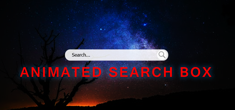
How to create animated search box with css?

First, we will see the simplest animated search box with css3. An input field html is the first step to create it.
HTML for animated search box
<form>
 <input type="text" name="search" class="animated-search" placeholder="Search...">
</form>
For creating a simple animated search box, add an input field, add type as text, add name attribute for it, also add placeholder attribute.
The next step is styling the text box.
CSS for Animated Search Box
.animated-search {
    width: 130px;
    box-sizing: border-box;
    border: 2px solid #ccc;
    border-radius: 4px;
    font-size: 16px;
    background-color: #fff;
    background: url('searchicon.png') no-repat 10px 10px;
    padding: 12px 20px 12px 40px;
}

We have styled the search box. So the next step is to add animation for the text input.
.animated-search {
    -webkit-transition: width 0.4s ease-in-out;
    transition: width 0.4s ease-in-out;
}
Animation is added with the transition css property.
* transition-property: width;
* transition-duration: 0.4s;
* transition-timing-function: ease-in-out;
When to happen the animation. We will add the the animation on focus of the search box.
.animated-search:focus {
    width: 100%;
}
Initially we have set the width of the search box to 130px. And on focus we are making the width as 100%. Our simple search box animation is ready.
The same way we can create different styles of search boxes with animation. We will see a few more. We will see how to create a little stylish animated search box, than the normal basic one.
HTML for Stylish Animates Search Box
<div class="sample">
   <input type="text" class="animated-search-2" name="search" placeholder="search" />
   <button type="submit" class="btn btn-search fa fa-search"></button>
 </div>
A wrapper div with the ‘sample’ class, a normal input tag and a button with search icon are the necessary tags for this stylish search box. Now we will see the styles needed for it.
CSS for Stylish Search Box
.sample {
          height: 50px;
          margin: 20px 0;
          position: relative;
          width: 30%;
        }
        .sample input{
          border-radius: 15px;
          right: 0;
          transition: all 0.3s ease-in-out;
          width: 50%;
        }
        .sample input:focus {
          width: 100%;
        }
        .sample input:focus ~ button.btn-search {
            background: hotpink url(search-icon.svg) no-repeat 0 0;
            background-size: 90%;
            color: #fff;
        }
        .sample button{
          transition: all 0.3s ease-in-out;
        }
        .sample button.btn-search {
          border-radius: 50%;
          height: 26px;
          right: 2px;
          top: 2px;
          transition: all 0.3s ease-in-out;
          width: 26px;
          cursor: pointer;
        }
Our stylish search button is ready. Lets have a look at it.
Demo for Stylish Animated Search Box