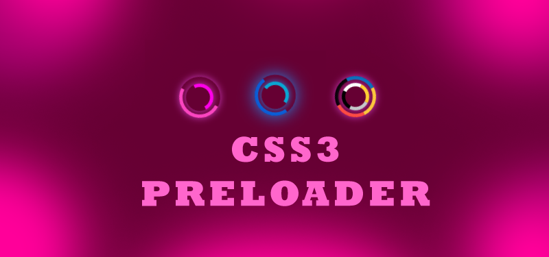
CSS3 preloader with animation is the new topic we will see today. We have seen many tutorials, examples or tricks and tips on css3 animations. In previous days, we used animated gif images or jQuery or javascript for adding preloaders in our web applications. But with the introduction of the CSS3, it is very easy to create animated preloaders. The css3 properties like keyframes and transform help us to create css3 preloader with animation. Please refer previous articles on css3 animation before you proceed.
Why to use css3 preloaders?
We have seen so many varieties of animated preloaders on web applications. If you have noticed, many of those preloaders are css3 preloaders. No animated gif images, but with css preloaders. Have you ever thought of the advantages of creating preloaders with pure css and html? One advantage is that the use of pure css and html for the preloader, other than using animated gif image or use of any image and animating them. Another advantage of css3 preloader is easily customizable. When we want change the theme of the application, we can change the color theme of the preloader, to match the application theme. We can create different creative preloaders with the help of css3 and html. So, we will see how to create an animated preloader with css3 and html.
Animated CSS3 preloader
Following is the simple html for adding a preloader.
<div class="circle"></div>
<div class="circle-one"></div>
We have added the html for the preloader. A div with the ‘circle’ class and another with ‘circle-one’ class. Now we will style the html elements with the css.
Css for the animated preloader
       .circle {
            background-color: rgba(0,0,0,0);
            border: 5px solid rgba(0,100,229,0.9);
            border-top: 5px solid rgba(0,0,0,0);
            border-left: 5px solid rgba(0,0,0,0);
            border-radius: 50px;
            box-shadow: 0 0 35px #2187e7;
            width: 50px;
            height: 50px;
            margin: 0 auto;
            -moz-animation: spin .8s linear infinite;
            -webkit-animation: spin .8s linear infinite;
        }

        .circle-one {
            background-color: rgba(0,0,0,0);
            border: 5px solid rgba(0,183,229,0.9);
            border-top: 5px solid rgba(0,0,0,0);
            border-left: 5px solid rgba(0,0,0,0);
            border-radius: 50px;
            box-shadow: 0 0 15px #2187e7;
            width: 30px;
            height: 30px;
            margin: 0 auto;
            position: relative;
            top: -50px;
            -moz-animation: spinoff .8s linear infinite;
            -webkit-animation: spinoff .8s linear infinite;
        }
Here in the css, we have given different width and height for the divs. One’s height and width are more the other div. We are adding border 5px with a color and the border-radius is set to 50% to make the div as a circle. At the end of the css, you can see the animation is called. The values for animation are given in the order; animation-name: spin; animation-duration: 8s; animation-timing-function: linear; animation-iteration-count: infinite. The following is css is added for animating the preloader. We will use keyframes to add the rotating effect.
       @-moz-keyframes spin {
            0% {
                -moz-transform: rotate(0deg);
            }

            100% {
                -moz-transform: rotate(360deg);
            };
        }

        @-moz-keyframes spinoff {
            0% {
                -moz-transform: rotate(0deg);
            }

            100% {
                -moz-transform: rotate(-360deg);
            };
        }

        @-webkit-keyframes spin {
            0% {
                -webkit-transform: rotate(0deg);
            }

            100% {
                -webkit-transform: rotate(360deg);
            };
        }

        @-webkit-keyframes spinoff {
            0% {
                -webkit-transform: rotate(0deg);
            }

            100% {
                -webkit-transform: rotate(-360deg);
            };
        }
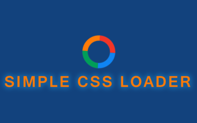
Our animated css3 preloader is ready.

CSS3 preloader with Special effects
We have created a simple animated preloader. How to add some styles or some different effects to this preloader? The following HTML and css will add some special effects to the preloaders.
HTML
<div class="spinner"></div>
<div class="spinner-inner"></div>
CSS
      .spinner {
            background-color: rgba(0,0,0,0);
            border: 5px solid rgba(0,183,229,0.9);
            opacity: .9;
            border-right: 5px solid rgba(0,0,0,0);
            border-left: 5px solid rgba(0,0,0,0);
            border-radius: 50px;
            box-shadow: 0 0 35px #2187e7;
            width: 50px;
            height: 50px;
            margin: 0 auto;
            -moz-animation: spinPulse 1s ease-in-out infinite;
            -webkit-animation: spinPulse 1s linear infinite;
        }

        .spinner-inner {
            background-color: rgba(0,0,0,0);
            border: 5px solid rgba(0,183,229,0.9);
            opacity: .9;
            border-left: 5px solid rgba(0,0,0,0);
            border-right: 5px solid rgba(0,0,0,0);
            border-radius: 50px;
            box-shadow: 0 0 15px #2187e7;
            width: 30px;
            height: 30px;
            margin: 0 auto;
            position: relative;
            top: -50px;
            -moz-animation: spinoffPulse 1s linear infinite;
            -webkit-animation: spinoffPulse 1s linear infinite;
        }

        @-moz-keyframes spinPulse {
            0% {
                -moz-transform: rotate(160deg);
                opacity: 0;
                box-shadow: 0 0 1px #2187e7;
            }

            50% {
                -moz-transform: rotate(145deg);
                opacity: 1;
            }

            100% {
                -moz-transform: rotate(-320deg);
                opacity: 0;
            };
        }

        @-moz-keyframes spinoffPulse {
            0% {
                -moz-transform: rotate(0deg);
            }

            100% {
                -moz-transform: rotate(360deg);
            };
        }

        @-webkit-keyframes spinPulse {
            0% {
                -webkit-transform: rotate(160deg);
                opacity: 0;
                box-shadow: 0 0 1px #2187e7;
            }

            50% {
                -webkit-transform: rotate(145deg);
                opacity: 1;
            }

            100% {
                -webkit-transform: rotate(-320deg);
                opacity: 0;
            };
        }

        @-webkit-keyframes spinoffPulse {
            0% {
                -webkit-transform: rotate(0deg);
            }

            100% {
                -webkit-transform: rotate(360deg);
            };
        }
So, our animated preloader with special effects is ready.
how to customize?
If we want to customize the css3 preloader, just change the colors of borders, width of the borders. If you want to add a background, add to the styles. So, it is very easy to customize the animated css3 preloder to match it with the application themes.