We have seen tool tips used in many of the web sites. When we hover on links or button, it will show a help text, which will tell what it is or what it is used for. This is called tool tip. A box with arrow which is pointing to some text or button. This is a common way of giving hints or showing help text. Let us understand how to create a tool tip only with CSS and HTML.
How to create tool tip with arrow using only css?
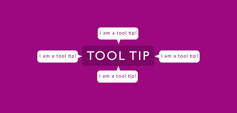
Basic idea of a tool tip
The key to create the tootips is the use of CSS pseudo elements (:after and :before). The :after pseudo element of the a tag is given attr(title) as its content and is styled accordingly. To create the arrow, :before pseudo element is used and the triangle is created using borders.
Basic HTML to create a tool tip
The following HTML code we will use to create a simple tool tip
<div class="tool-tip">Help text here..</div>
Add a wrapper with the class “tool-tip” and the text which you want to show.
CSS for the tool tip
We will style the “tool-tip” box with the following styles.
.tool-tip {
    position: relative;
    background: #d53c74;
    border: 1px solid #a80768;
    width: 150px;
    height: 40px;
    border-radius: 5px;
    padding: 10px;
    font-size: 14px;
    color: #fff;
    box-sizing: border-box;
    box-shadow: 0px 2px 3px #999;
    text-align: center;
}
Now our tool tip box and its content is styled. But how to add the arrow or triangle? Using the pseudo element properties in CSS we will create the arrow. The following css shows how to create the triangle or arrow shape with the pseudo elements.
.tool-tip:after, .tool-tip:before {
    left: 100%;
    top: 50%;
    border: solid transparent;
    content: " ";
    height: 0;
    width: 0;
    position: absolute;
    pointer-events: none;
}
.tool-tip:after {
    border-color: rgba(136, 183, 213, 0);
    border-left-color: #d53c74;
    border-width: 10px;
    margin-top: -10px;
}
.tool-tip:before {
    border-color: rgba(194, 225, 245, 0);
    border-left-color: #a80768;
    border-width: 10px;
    margin-top: -11px;
 }
Our tool tip html and css is ready. Let us see the demo to see how it is displaying.
Demo for Tool Tips

Animated tool tip with CSS3
How to make the tool tip view interesting ? We will add some CSS3 animation to the tool tip. When we hover some element, the tool tip displays with animation. The following CSS3 will do the animation part for us.
.tool-tip-wrapper {
    position: relative;
}
.tool-tip-wrapper .tool-tip-4 {
    visibility: hidden;
    position: absolute;
    top: -40px;
    -webkit-transition-property: top;
    -moz-transition-property: top;
    transition-property: top;
    -webkit-transition-duration: 0.5s;
    -moz-transition-duration: 0.5s;
     transition-duration: 0.5s;
}
.tool-tip-wrapper .dummy-container:hover .tool-tip-4 {
     top: -20px;
     visibility: visible;
}
HTML for animated tool tip
<div class="tool-tip-wrapper">
    <div class="dummy-container">This is a dummy text! <a class="link-tooltip" href="#">Hover me</a> to see tooltip..
        <div class="tool-tip-4">
            I am a tool tip!
        </div>
    </div>
</div>
Demo for Animated Tool Tips