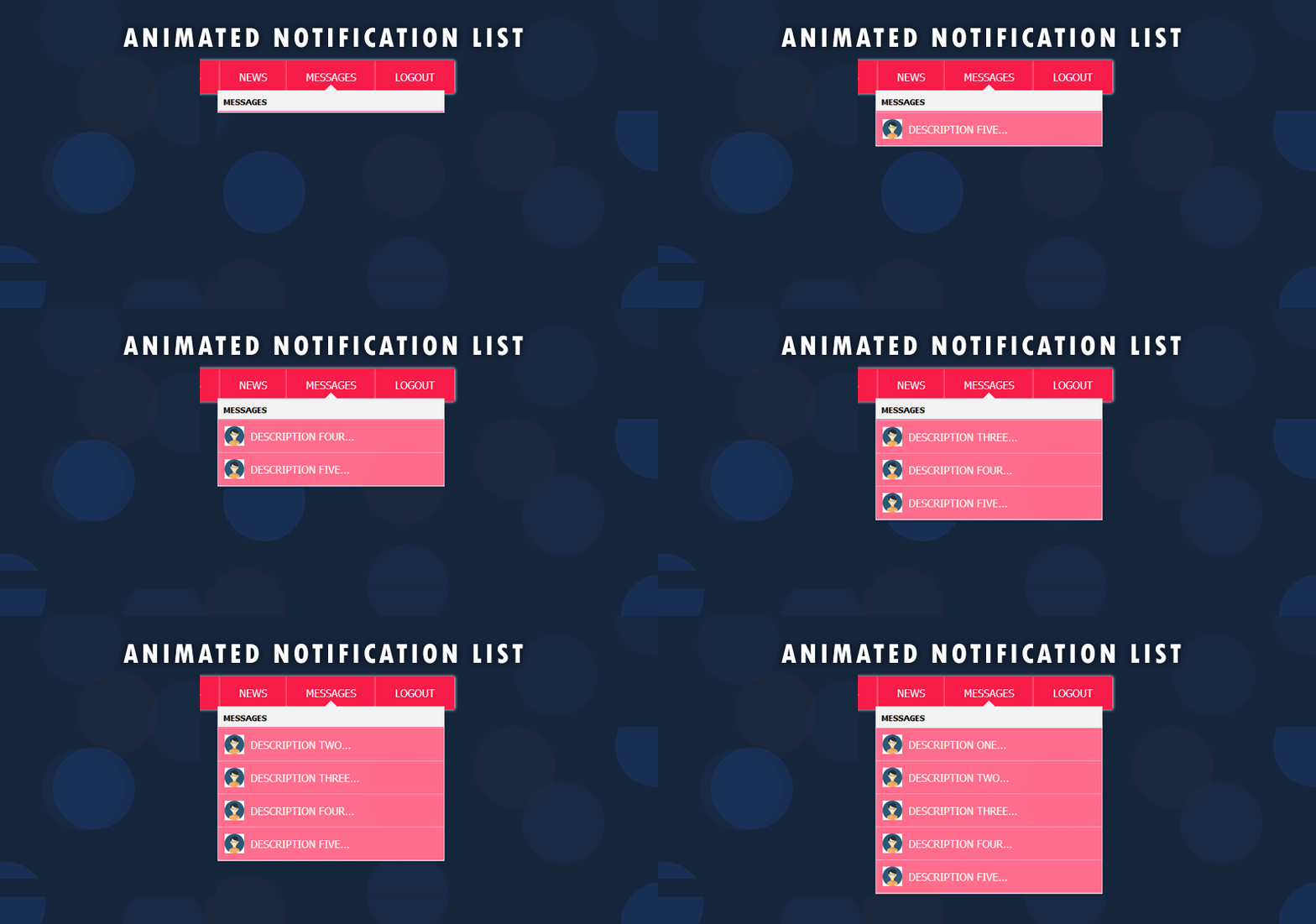
Animated notification list – In one of our previous article, we have seen how to create a notification popup easily with the help of minimum HTML, CSS3 and javascript/jQuery. As We all are familiar with notification pop up on different social medias or portals like Linkedin, Facebook etc…, it is good to learn how to create a notification popup easily. We must have noticed in web or mobile applications, the number of notifications are shown near to a bell icon and when we click on the notification numbers or link, a pop up is displayed with the notification details.

Animated Notification List with CSS3 animation
As we know or we have seen, it is easy to create a notification pop up with the help of very little HTML, css and javascript. But in this tutorial, we will see how to create a notification list which has some animations. The animations on your web page makes it more interesting for the end user. The features in CSS3, helps us to add some animation effects to the elements, rather than adding animations with a lot of javascript or jQuery.
Why animated notification list?.
Obviously, you must have a question, why we want to add animation to the list? If you are planning to implement lists in your websites in positions like navigation list or sidebar list, by animation we can improve user interaction for a webpage. So that user will notice what is happening in a page if some actions are done. This will increase the user attention to convey from where the list is getting arrived. So, things are clear… we will go forward with the implementation of the animated notification list.
HTML for Animated Notification List
<div class="menu-container">
 <ul id="menu">
 <li><a href="#">Home</a></li>
 <li><a href="#">About</a></li>
 <li><a href="#">Services</a></li>
 <li><a href="#">News</a></li>
 <li id="notification_li">
    <span id="notification_count">5</span>
    <a href="#" id="notificationLink">Messages</a>
    <div id="notificationContainer">
       <div id="notificationTitle">Messages</div>
       <div id="notificationsBody" class="notifications">
           <ul class="slide-animation" id="animated-list">
               <li>
                  <a href="#">
                      <img src="perosna.jpg" class="persona" title="Persona" title="Persona" />
                      <span class="list-text">Description One...</span>
                  </a>
               </li>
               <li>
                  <a href="#">
                      <img src="perosna.jpg" class="persona" title="Persona" title="Persona" />
                      <span class="list-text">Description Two...</span>
                  </a>
               </li>
               <li>
                  <a href="#">
                      <img src="perosna.jpg" class="persona" title="Persona" title="Persona" />
                      <span class="list-text">Description Three...</span>
                  </a>
               </li>
               <li>
                  <a href="#">
                       <img src="perosna.jpg" class="persona" title="Persona" title="Persona" />
                       <span class="list-text">Description Four...</span>
                  </a>
               </li>
               <li>
                  <a href="#">
                       <img src="perosna.jpg" class="persona" title="Persona" title="Persona" />
                       <span class="list-text">Description Five...</span>
                  </a>
               </li>

            </ul>
        </div>
    </li>
 <li><a href="#">Logout</a></li>
 </ul>
 <div class="clear"></div>
 </div>
First, we add a menu, which has few items like ‘Home’, ‘About’, ‘Messages’ etc… Add a class to the the ‘li’ for which has ‘message’ text. Inside this li, add the html for the pop up and the list items. Add few list items in the pop up, and add whatever content you want. Now, our HTML is ready. So we’ll see how to style the menu and pop up for a better look!
CSS for the main menu
#menu{
        margin: 20px;
	padding: 0px;
	font: normal 12px Tahoma;
	text-transform: uppercase;
}
#menu li {
	float: left;
	background: #F81C48;
	box-shadow: 1px 0 4px #fff;
	position:relative;
        list-style-type: none;
}

#menu li a {
	color:#fff;
        font-size: 16px;
	text-decoration:none;
	display: inline-block;
	padding: 15px 30px;
}
#menu li a:hover{
	color:#15253C;
	background: #FF6D8C;
}
Our main menu is styled now. We will add the notification count next to the message link.
#notification_count {
      padding: 3px 7px 3px 7px;
      background: #cc0000;
      color: #ffffff;
      font-weight: bold;
      border-radius: 9px;
      -moz-border-radius: 9px;
      -webkit-border-radius: 9px;
      position: absolute;
      right: 5px;
      margin-top: -11px;
      font-size: 11px;
}
We will add styles for the pop up notification list.
#notificationContainer {
            background-color: #fff;
            border: 1px solid #E6E6E6;
            -webkit-box-shadow: 0 4px 8px rgba(0, 0, 0, .25);
            overflow: visible;
            position: absolute;
            top: 46px;
            left: -175px;
            margin-left: 50%;
            width: 350px;
            z-index: 1;
            display: none;
        }
        #notificationContainer:before {
            content: '';
            display: block;
            position: absolute;
            left: -10px;
            width: 0;
            height: 0;
            color: transparent;
            border: 10px solid black;
            border-color: transparent transparent #F2F2F2;
            margin-top: -20px;
            margin-left: 50%;
        }
        #notificationTitle {
            font-weight: bold;
            padding: 8px;
            font-size: 13px;
            background-color: #F2F2F2;
            /*position: fixed;
            z-index: 1000;
            width: 334px;*/
            border-bottom: 1px solid #dddddd;
        }
        #notificationsBody {
            padding: 0px 0px 0px !important;
            min-height:200px;
            overflow: hidden;
        }
So, the notification pop up container is ready. Now the styling of the notification list items in the pop up.
#menu li #animated-list{
            float: none !important;
            padding: 0 !important;
        }
        #menu li #animated-list li{
            float: none !important;
            background: transparent;
            border-bottom: 1px solid #F9A4CD;
            box-shadow: 0 0 0 transparent;
        }
        #menu li #animated-list li a {
            display: block;
            padding: 10px;
            background: #FF6D8C;
        }
        #menu li #animated-list li a:hover {
            background: #F81C48;
        }

        .persona {
            width: 30px;
            height: 30px;
            float: left;
        }

        .notification-text {
            display: inline-block;
            line-height: 30px;
            padding-left: 10px;
        }
        .list-text {
            display: block;
            line-height: 30px;
            margin-left: 40px;
        }
Our notification list content is ready with its styles and a good look. The remaining css addition is for animating the notification list items. We will add those styles at the end. Now, we will add the click functions for opening the pop up and closing.
Script for Notification List
<script type="text/javascript">
     $(document).ready(function() {
         $("#notificationLink").click(function() {
         $("#notificationContainer").fadeToggle(300);
         $("#notification_count").fadeOut("slow");
         return false;
     });

     //Document Click hiding the popup
     $(document).click(function() {
         $("#notificationContainer").hide();
         $("#animated-list").removeClass("show");
     });

     //Popup on click
     $("#notificationContainer").click(function() {
        return false;
     });

     $("#notificationLink").click(function(){
        if($("#animated-list").hasClass("show")){
           $("#animated-list").removeClass("show");
        }
        else{
           $("#animated-list").addClass("show");
        }
       });

    });
 </script>
Animation for the Notification List
As we added the script for opening and hiding the notification list pop up, the next step is to add some animation for the list, when it is displaying. In this article, we will add sliding effect for the notification list items; sliding from left.
.slide-animation li{
       transform: translateY(-500%);
       transition: all 0.6s ease;
}
.slide-animation.show li{
       transform: translateY(0%);
}
Yes, the animation part is done. Out animated notification list is ready for demo.
