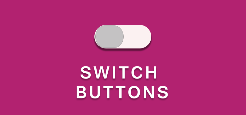
Now a days, almost all thwebsites are decorated with stylish buttons and icons. The user will more look in to the appearance of elements or the look and feel of the web pages. Different CSS3 properties help us to make our websites very beautiful, without using any images for buttons or icons. CSS3 has changed the full concept of Web UI. Here in this tutorial, we will see how to create a stylish switch button using CSS3, HTML and a few lines of jQuery.
Steps for creating a Stylish Switch Button

First of all, we have to add the the html needed for creating a switch button. To try this example, create a basic html page with necessary tags like head, body tags.
HTML for Switch Button
<div class="switch-button"></div>
We will use a ‘div’ element for creating a switch button and ‘switch-button’ class will be assigned to it. Now let us style this div to look like a switch button. We will be using the CSS3 properties like border-radius, transition and some other properties for styles our switch button div.
CSS for Switch Button
.switch-button {
    width: 62px;
    height: 32px;
    background: #FF0080;
    z-index: 0;
    margin: 0;
    padding: 0;
    appearance: none;
    border: none;
    cursor: pointer;
    position: relative;
    border-radius:16px;
    -moz-border-radius:16px;
    -webkit-border-radius:16px;
}
Specify width and height for the div also position it. And give border radius to style it. No here comes the use of Pseudo elements. The ::before pseudo-element can be used to insert some content before the content of an element and :after pseudo-element can be used to insert some content after the content of an element.
.switch-button:after {
    content: ' ';
    height: 29px;
    width: 29px;
    border-radius: 28px;
    background: #fff;
    position: absolute;
    z-index: 2;
    top: 1px;
    left: 1px;
    -webkit-transition-duration: 300ms;
    transition-duration: 300ms;
    -webkit-box-shadow: 0 2px 5px #999999;
    box-shadow: 0 2px 5px #999999;
}
Here, we are adding a circle after the content of the div using :after pseudo element and we are adding some animation, so that the button transition is smooth, when we click on it. This element which is added should be positioned absolute.
Now we will add the background color for the switch button when it is clicked.
.switchOn,.switchOn:before {
    background: #B4045F !important;
}

.switchOn:after {
    left: 32px !important;
}
We toggle the element; ie. adding or removing the class name ‘switchOn’. When the switchOn class is added, we will position the pseudo element as given in the css.
Now, let us add the toggle effect using a few lines of jquery.
$(document).ready(function(){
   $('.switch-button').click(function(){
     $(this).toggleClass("switchOn");
   });
});
What the jquery script here does? When we click on the switch button, it is adding a new class “switchOn” and when clicked again, the same class is removed from the div. This switch button which we have added only will display the switching effect. In case if we want to add this switch button in a form and capture the value, what we can do? The following shows how to capture the values of a switch button when it is switched.
First of all, we’ll wrapper the switch-button div with a label. Then add add a checkbox input inside the label. Now the input and switch button div are wrapped up with label.
<label>
<input type="checkbox" name="checkboxName" class="checkbox" id="myCheckbox"/>
<div class="switchBig"></div>
</label>

When the switch button is clicked, the check box will be checked. Now we can get the value from checkbox. If we want to hide the checkbox, we can use CSS for hiding it. Even, then we will be able to get the status of the checkbox.
Now, try creating a switch button with the help of this tutorial.
Demo for Switch Buttons
Check the demos for stylish switch Button

